Mountains of Data
Every day, your smart phone or smart watch contribute to collecting 750 quadrillion bytes of data[1] (30% of the worlds data production) on your health, exercise and activity levels.
Could it help:
- reduce your risks of Cancer? Heart disease? Hypertension? Diabetes?
- save lives in a combat zone?
- predict chronic fatigue, illness and behavioural changes?
You bet!
Personal Healthcare Revolution
A wearable health care revolution has begun where the paradigm moves from Reactive Health, where a person is sick enough to be admitted and monitored in hospital, to Proactive Health where historic monitoring of a personal biometric ‘fingerprint’ is sensitive enough to see when data departs from the norm, ensuring early care.[2]
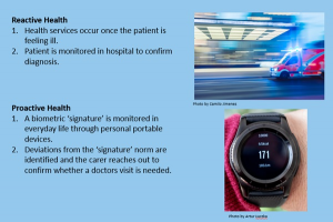
Figure 1. Wearables Move Heath Monitoring from the ‘Monitor Last’ Model to a ‘Monitor First’ Model.
5x Google
Fortune reported that “Human data … is transforming healthcare and fuelling a “new gold rush” of tech giants eager to cash in on this data revolution,” BDO points out that data-rich Facebook and Google’s advertising business is estimated to be worth $200 billion. “Health care is 15 times bigger than that,” “We spend $3 trillion. In theory, … you’ll have 15 Facebooks and 15 Googles. That’s what’s up for grabs.” [3]
Tim Cook recently said “Apples greatest contribution to mankind…it will be about heath.” [4]
Where Activity Trackers Fit
The sweet spot for Activity Trackers in health lies in monitoring lifestyle controllable diseases like cardiac risk, hypertension, diabetes, and obesity. This is because there is a
- necessary sensor and activity monitoring component
- and activity and exercise contribute to a cure or rehabilitation.
BUT there is a problem.
It’s Not About the Data
“It’s not the data,” says Eric Topol, director of the Scripps Translational Science Institute. “It’s the analytics.”[5]
The current paradigm for wearable Activity Tracking is to present single metrics like Activity Minutes, Steps, Average Heart Rate, and Stairs Climbed as separate pieces of information leaving the consumer to make sense of it.
We see this paradigm in all major wearable devices in market.
‘Isolated metrics’ mean less accuracy, meaning and value.
Here are 2 examples…. in the image, Marcia’s tracker has counted 6,480 steps so far.
![]()
Figure 2. Great Devices can still be misused.
The graphic below presents the use of digital methods to guide and monitor patients between doctors’ visits which is ground-breaking.
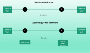
Figure 3. Digital Healthcare Monitoring Model
Analysing the numbers isn’t easy though. For example, a ‘5-day streak’ isn’t always good. A 5-day streak where a person gets progressively exhausted is a bad thing.
An ‘out of range biometric’ can be out of range for all kinds of reasons. Let’s try a thought experiment. You receive a phone call from someone worried that their heart rate is too high. What questions would you ask to make sense of things? To help, here are some reasons heart rate changes:
- Your Level of exertion,
- Recentness of exertion,
- Activity type and posture,
- Temperature,
- Being at altitude,
- Feeling stressed or anxious,
- Fatigue,
- Illness,
- Fitness,
- Age,
- Or a heart abnormality
Obviously, you must add more information; the CONTEXT, to fully understand what is happening.
How Data Becomes More Valuable and Useful
A metaphor for ‘making sense of data’ is a concept known as the DIKW Pyramid.[6] (Data-Information-Knowledge-Wisdom).
The concept explains that:
- Things we perceive are described by multiple facets (e.g. ears, trunk, tusks etc) = DATA
- We create metrics and put labels (classifications) on these things (e.g. elephant) = INFORMATION
- We then draw relationships, patterns and comparisons between things = KNOWLEDGE
- We can then draw insights/predictions from the relationships and comparisons = WISDOM.
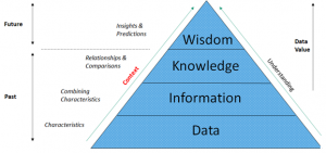
Figure 4. DIKW Pyramid
Each step up the pyramid provides more accurate, deeper answers and adds more value to the data.
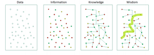
Figure 5. Another Way to Visualise the DIKW Concept.
The idea of DIKW as an analogy lies at the root of Machine Intelligence and how we think.
Activity Trackers Have Struggled
Activity Trackers have been stuck for a decade. They:
- Measure Activity (DATA)
- And create graphs and metrics. (low level INFORMATION – numbers, if you can understand them.)
This isn’t very far up the DIKW pyramid.
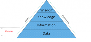
Figure 6. Wearables Current Progress up the DIKW Pyramid
To move further up the pyramid to high level INFORMATION, KNOWLEDGE and WISDOM, a different approach to ‘isolated metrics’ is needed. One that we already use every day.
CONTEXT is Everything!
Context is so important and fundamental to making sense of the world that it is referred to in Cognitive Psychology; the study of how you and I think, as Bottom-up and Top-down Processing.
- Bottom-up processing refers to the way sensory information is built up from the smallest pieces of sensory data.
The characteristics you perceive combine to form a label. (a ‘something’)
- In Top-down processing, you apply what you already know and expect to perceive (the whole) and then access the individual parts as needed.
The label can be broken into characteristics.
When we learn about something new, this usually takes the form of the characteristics and the whole; two sides of the same coin.
As you move up the pyramid, THE most fundamental necessity is the ability to gather up the right relationships between ‘isolated pieces’ of data; the CONTEXT.
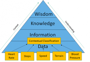
Figure 7. The Different Streams of Raw Data that Help Create the Initial Context.
It is this approach that presents a GOLDEN OPPORTUNITY for wearables in the Digital Health Revolution.
The Difference CONTEXT Makes to Data Value
Let’s see how powerful context is at making sense of activity and health data. What follows uses off-the-shelf sensors found in most smart phones and watches (minus blood pressure).
a. Heart Rate
It’s obvious that heart rate (below in red) by itself is meaningless. You need to be able to relate it to something.
There is no story that the heart rate gives us – it’s just an ‘isolated metric’ with no context.
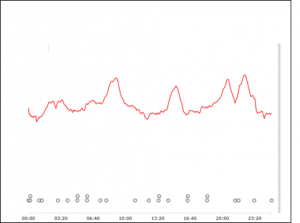
Figure 8. Heart Rate Data Over a 25 Minute Period.
b. Add Step Rate (Accelerometer)
We use the accelerometer in our smart watch to establish step rate (below in yellow). It indicates step rates that would be expected for walking and pausing.
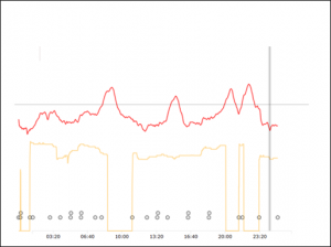
Figure 9. Heart Rate and Step Rate Data Over a 25 Minute Period.
c. Add Speed (GPS)
To be sure, let’s add speed (below in blue) to make sure the user isn’t on an elliptical trainer.
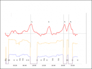
Figure 10. Heart Rate, Step Rate and Speed Data Over a 25 Minute Period.
The user is outside; good GPS data, and the speed matches walking. But strangely, the users heart rate peaks (1. 3. 4. above) when the step rate and speed are zero (yellow and blue line = zero). The highest heart rates are occurring during an Inactive period!
d. Add Terrain (Barometer)
Let’s now use the barometer in the smartwatch to see the terrain (below in brown).
- We can see that heart rate (in red below) increases each time the user goes uphill. (brown)
- We can now make sense of the heart rate peaks while inactive. We can see cardiac lag; the effect where heart rate is slow to respond to changes in activity. The user is recovering from hill climbs and due to heart rate lag, their heart rate is still high as they initially recover while inactive. Without terrain as context, you could inaccurately assume that a high heart rate while inactive means a concerning ‘out of range biometric’.
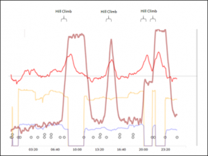
Figure 11. Heart Rate, Step Rate, Speed and Altitude Data Over a 25 Minute Period.
e. Add Blood Pressure
Let’s now add blood pressure. (Systolic BP = purple dots, Diastolic BP = green dots).
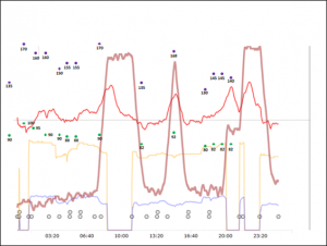
Figure 12. Heart Rate, Step Rate, Speed, Altitude and Blood Pressure Data Over a 25 Minute Period.
Stop for a sec! Look at the graph above. (Fig. 12) It’s a tangled chaotic mess! It would be impenetrable at first glance without the lead up to understanding each piece in context.
f. ‘Isolated Metrics’ Tell a Poor Story
Using the current ‘isolated metrics’ paradigm, we see it’s weakness. All we can say is:
- The person’s heart rate was going up and down (heart rate sensor)
- They were walking, or on an elliptical, or jumping up and down (accelerometer sensor)
- They were moving slowly. (GPS sensor)
- The altitude went up and down. (barometer sensor)
- Their blood pressure was high and low. (blood pressure sensor)
Isolating data from other data has a huge effect on meaningfulness. As with everything in life, it’s the relationships that matter. 😊
g. Context Tells a Rich and Useful Story
With context, an accurate picture forms and what the DIKW calls KNOWLEDGE is now possible.
- The user is walking.
- Accelerometer + GPS
- We see that blood pressure was initially high (Systolic >150mm/Hg, Diastolic > 85 mm/Hg) early in the walk but then settled down.
- Blood pressure + Accelerometer + Time
- We see that effort on the hills was high which effected blood pressure.
- Barometer + Heart rate + Blood Pressure
- We can see that it might be better to avoid higher intensities (hills) to start with and let easier activity create the initial improvements.
- Heart rate + Barometer +Blood Pressure
- We know that walking as exercise for this user has promising effects on their prehypertensive blood pressure.
As we move from a to e, the story becomes clearer and more accurate. It’s not hidden in an impenetrable ‘black box’ that no one understands. The context ‘describes’ a situation that we or A.I. can relate to, make decisions on and do something about.
Remember that the ‘do something about’ bit is WISDOM; we have moved from the bottom to the top of the DIKW Pyramid.
What you are seeing visually can employ contextual algorithms that consider relationships and organise the data at each level in such a way that it all makes sense.
It isn’t just ‘isolated metrics’ on a wearable; steps, stairs climbed, activity minutes and average heart rate.
Contextualising data seems innocuous but in fact it has the potential to revolutionise wearable data.
Put simply;
- Wearables mean data,
- Data needs analytics,
- And analytics needs context.
CONTEXT unlocks the meaning, ensures accuracy, creates trust and builds value.
If you’re interested in making more sense of your wearable data, contact us.
References:
[1] Bryant. M. (2018) Healthcare Dive Website. “Big Data is the ‘new gold rush,’ report predicts”. https://www.healthcaredive.com/news/big-data-the-new-gold-rush-report-predicts/519515/ Accessed September 2019.
[2] Schussler-Fiorenza Rose. S. et al. Nature Medicine Website. “A longitudinal big data approach for precision health” https://www.nature.com/articles/s41591-019-0414-6 Accessed September 2019.
[3] Fry. E. Mukherjee S. (2018) Fortune Website. “Tech’s Next Big Wave: Big Data Meets Biology” https://fortune.com/2018/03/19/big-data-digital-health-tech/ Accessed September 2019.
[4] Leswing. K. (2019) Tim Cook says that improving people’s health will be ‘Apple’s greatest contribution to mankind’ Business Insider (AUS) website. https://www.businessinsider.com.au/tim-cook-says-health-will-be-apples-greatest-contribution-to-mankind-2019-1?r=US&IR=T Accessed September 2019.
[5] Fry. E. Mukherjee S. (2018) Fortune Website. “Tech’s Next Big Wave: Big Data Meets Biology” https://fortune.com/2018/03/19/big-data-digital-health-tech/ Accessed September 2019.
[6] Figueroa. A. Towards Data Science Website: “Data Demystified – The DIKW Model.” https://towardsdatascience.com/rootstrap-dikw-model-32cef9ae6dfb